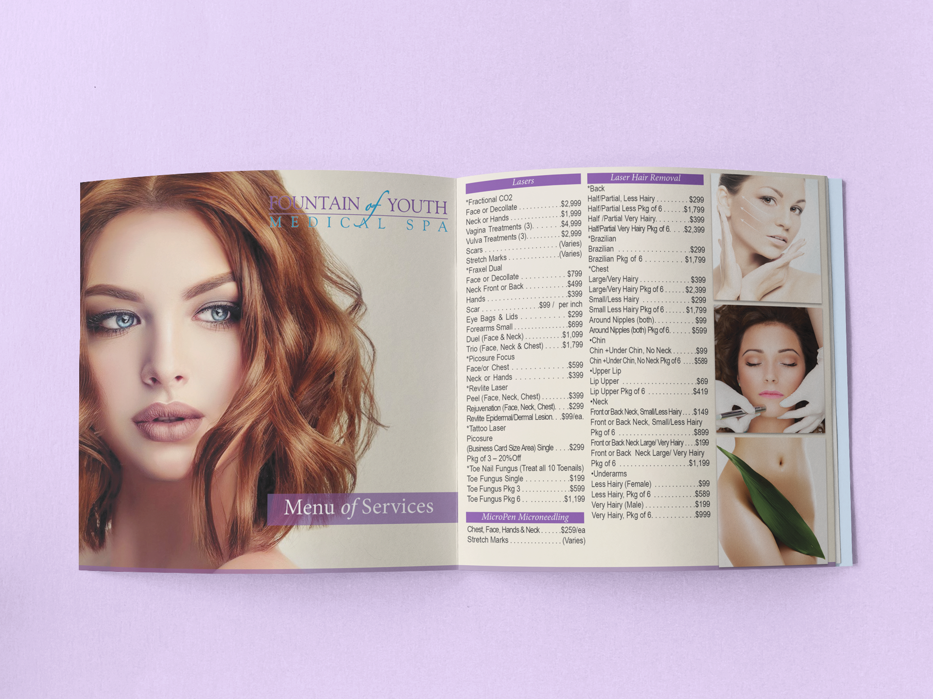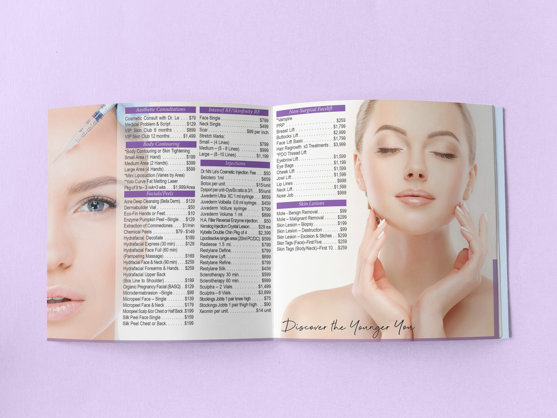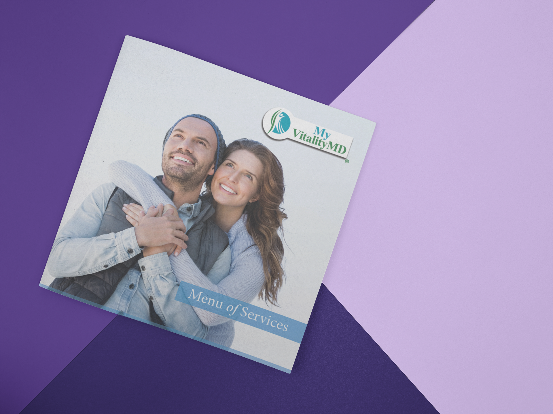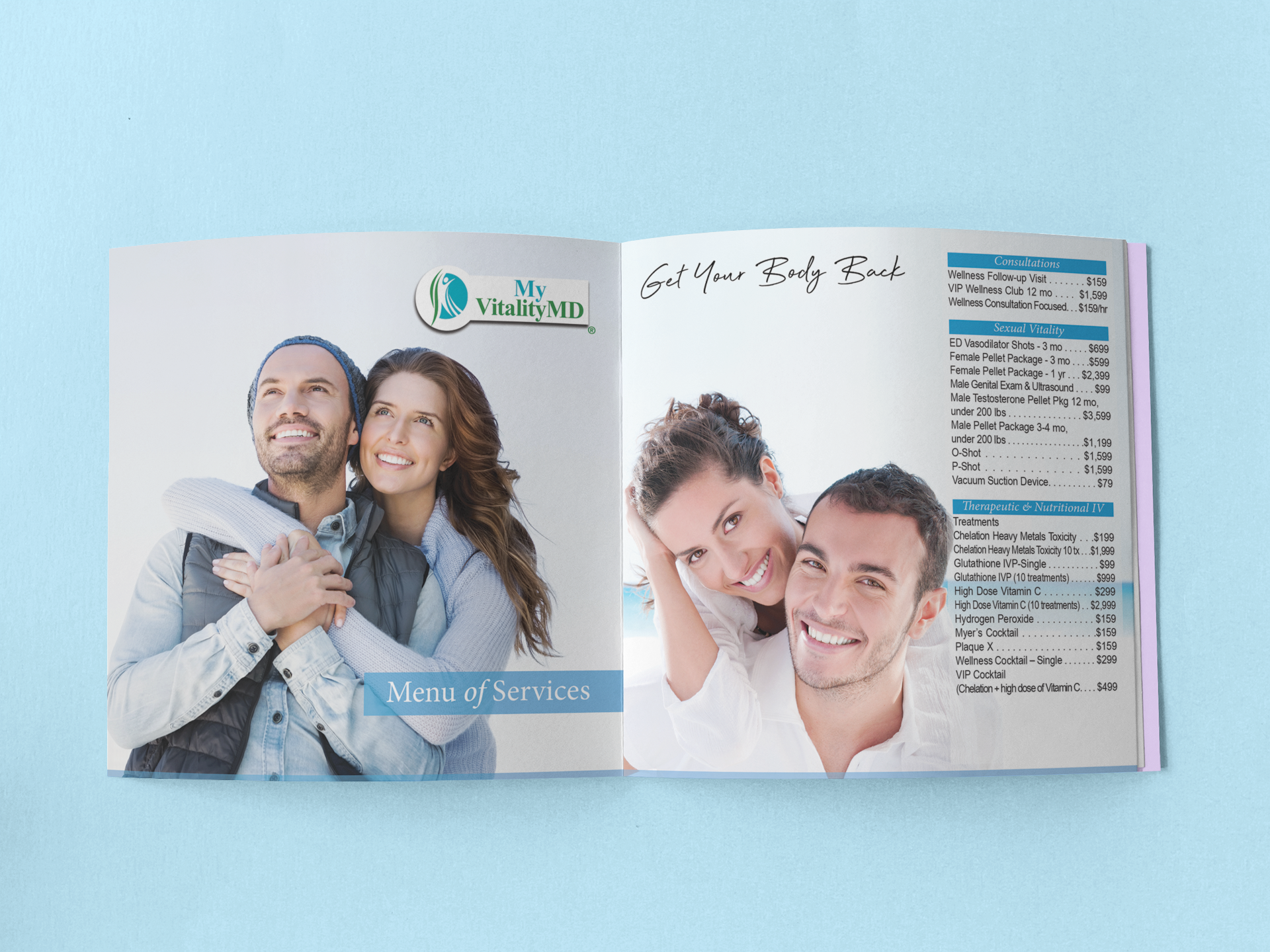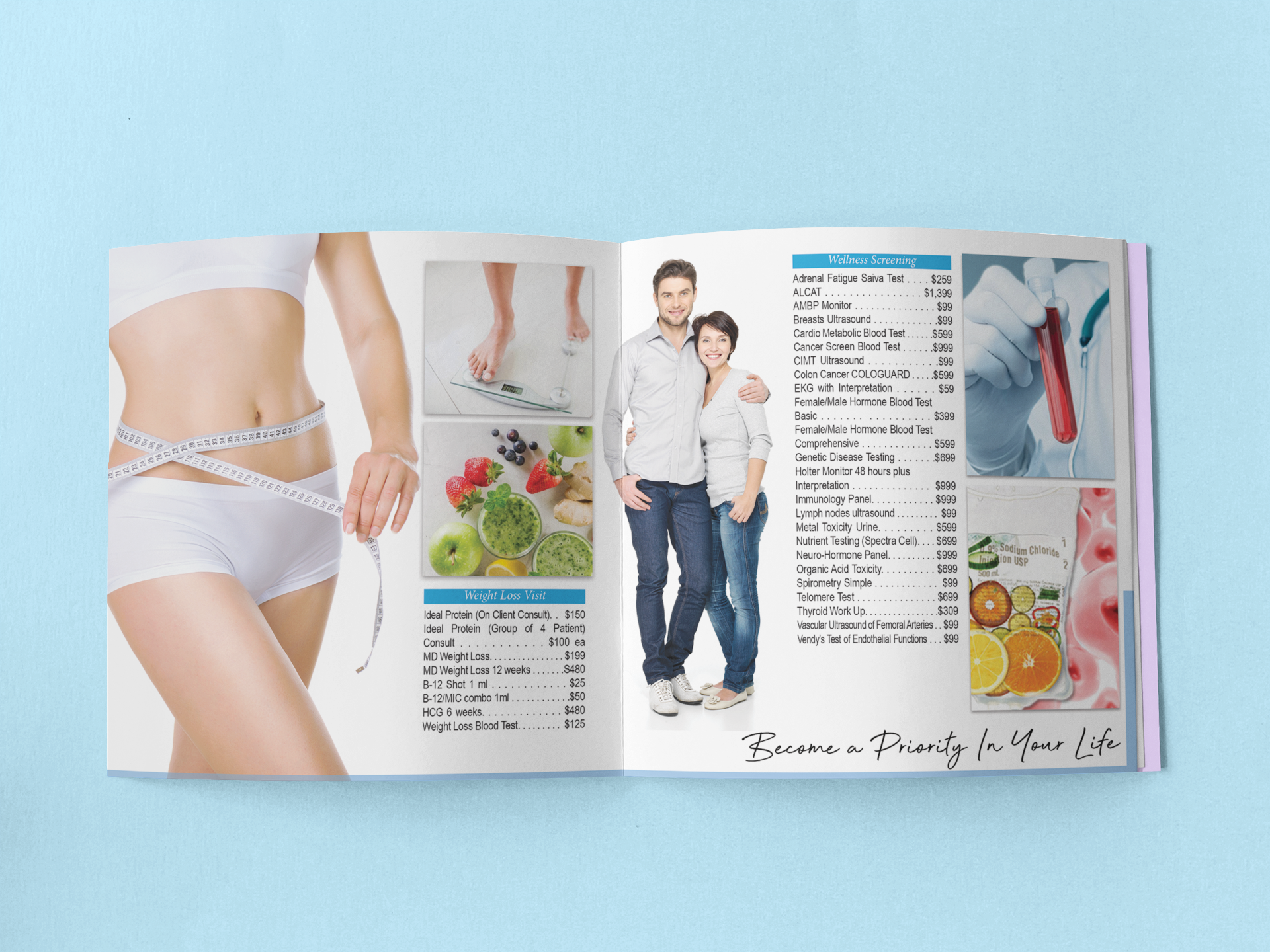
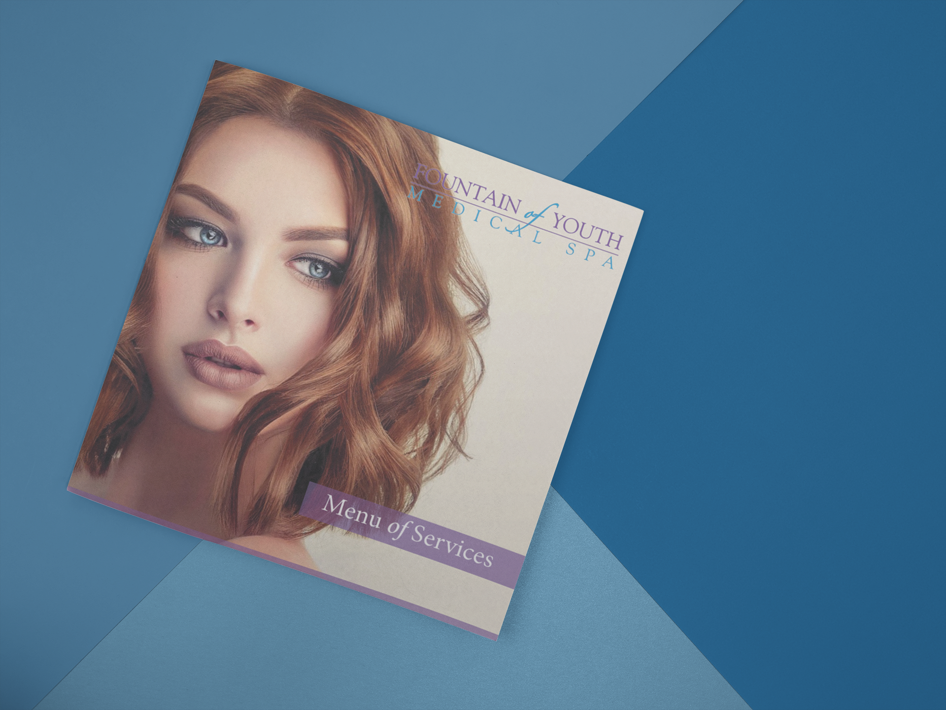
My client wanted to put together a quad-fold brochure showcasing her menu of services for Fountain of Youth and My Vitality. We created a menu that you'd open on one end to see the services for Fountain of Youth and if you turned and flipped it, you'd see the services for My Vitality. To ensure the flow of this transition I kept the design aesthetic the same, but used I used colored information dividers and text blocks to break up the two.